
CMF Design: Trends an Tips
The creation of inspiring and unique interiors passes more and more through the systematic study of colors, materials and finishes. An approach and discipline that we decided to explore with Olga Salvoni, CMF Designer and trainer.
In each of us, color inspires different emotions and feelings. It is a pervasive factor that often influences our choices and shapes our perception of the world. A color can attract us, repel us. Not everyone knows about the CMF Design you are involved in, would you like to tell us more about it?
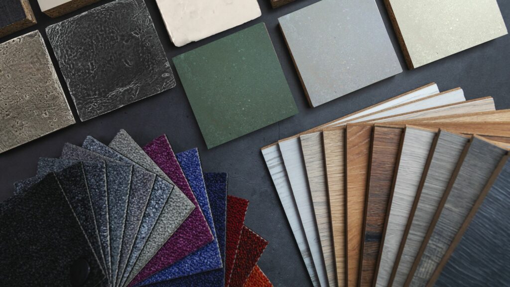
No matter whether it’s a brand or a product, the ability of expression is key. Colors, materials and finishes – CMF Design – are their expressive languages. The CMF designer is the one who is in charge of choosing the colors, materials and finishes of a product/space with the goal of valorizing it among others. The CMF designer develops different types of projects, from architecture to product and collection design to material research and trend analysis.
Everyone has their own color. But when it comes to creating an ambience, it is not enough to just depend on our instincts. What are the main factors to consider?
Color is a key aspect of room design, as it influences not only our visual perception but also the way we experience spaces.
When colors are chosen for a space, it is important to consider the following aspects:
- the use
- size of the space
- shape
- the orientation of openings
- the distribution of light
- the time of day in which the space is experienced
- length of time in which one is
For example, if the house is oriented north you will have less lighting and it is recommended to use warm colors such as beige, browns, oranges. In contrast, in the south, neutral and cool hues can also be effective.
That being said, here are the pairings for each space.
- ENTRANCES AND CORRIDORS: These rooms can be characterized with color being among the first we experience when we enter a home. Matching can be used to visually divide spaces.
- THE KITCHEN: It is best to avoid strong colors that can alter the appearance of food. Neutral and light colors are recommended. Vivid, saturated colors can be used in small parts.
- THE LIVING ROOM: The Living area is often the central part of the home. A palette of light or neutral colors is recommended. Saturated or dark colors can be used on individual walls and small areas.
- BATH AND WELLNESS: The colors traditionally used in these spaces are whites, blues and greens related to water and the idea of hygiene. Larger bathrooms with the presence of a bathtub require the use of neutral colors. Smaller bathrooms can be colored with more saturated hues.
- NIGHT ZONE: In the sleeping area, it is important to lower the brightness to create relaxing spaces. Desaturated, medium and dark tones are suggested.
- CHILD SPACES: color, if the room allows, can be used to divide different parts of the room according to function: sleeping area (dark colors), play area (lighter). You can lower the horizon line by painting the wall halfway or up to door height.

As for materials, what can you tell us?
Design is also rediscovering the need for more sustainable living and developing circular economy and green design projects. New bio-materials are developed from organic and sustainable sources, take advantage of waste, and are biodegradable to reduce the impact on the environment. For example, seaweed and other waste by-products from the sea are a resource with many possible applications, from bioplastics to textiles. So are sustainable biocomposite materials developed from recycled food (such as nut shells, eggs, orange peel), agricultural and garden waste. The color of these materials almost always comes from the very color of the raw material used to produce it. Often the color changes over time and makes each product unique.
From this ability to influence us, color plays a strong role in every project. In the design and furniture industry, what are the main trends of the moment?
New trends in design and color reflected the historical period we are living in, with the great changes, new needs and requirements.
Interiors and design are adapting by placing the inhabitant and his or her needs at the center.
Well-being is an important theme, and the reflection focuses particularly on nature and the balance between man and nature. The colors are those of nature, from greens to browns to ochre tones with an alternation of dark and light.
In addition, high craftsmanship and small manufactures are rediscovered and revalued through the designers’ new interpretations of local materials and traditional workmanship. These products are an expression of the material, they have the beauty of unique, handcrafted pieces where the trace of the human hand is left visible.
There is also a return to color and decoration, the graphic pattern is defined by the coloring of the materials, the contrasting finishes attract and intrigue. A collection out of the ordinary, unconventional and exclusive, in a perfect combination of inventiveness and originality. Spaces are not traditional spaces, geometries enter the home, decorate and surprise.
During the last Event you told us about Application Matrix, would you like to elaborate?
In CMF Design, color and material management is done through matrices and diagrams. There are diagrams that show:
- the complexity of the environment,
- others the balance between number of colors and materials,
- still others allow us to understand how to apply trends to the design.
Using these tools aids design and allows us to verify individual choices.
A big thank you to Olga Salvoni, CMF Designer for telling us about her profession, to learn more visit her website or read the article “CMF Design according to Fangorosa”
If you want to stay updated, follow us on our Social channels.