Color Palette: how to read it and where to find it.
To free one’s creativity, one needs partners like the color palette, here’s how to read it and where to find it. A design tool for architects and interior designers.
Fangorosa is the first e-commerce of surfaces in Italy, but it is also a style, a way of being, a creative approach to work that is fuelled by research, contamination and the need to share a common path with architects and interior designers. And it is exactly to them that he wanted to dedicate an important tool. Read on to find out which one.
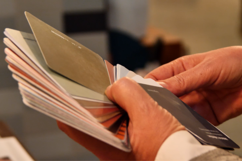
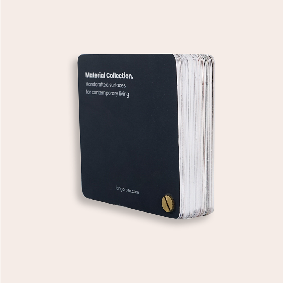
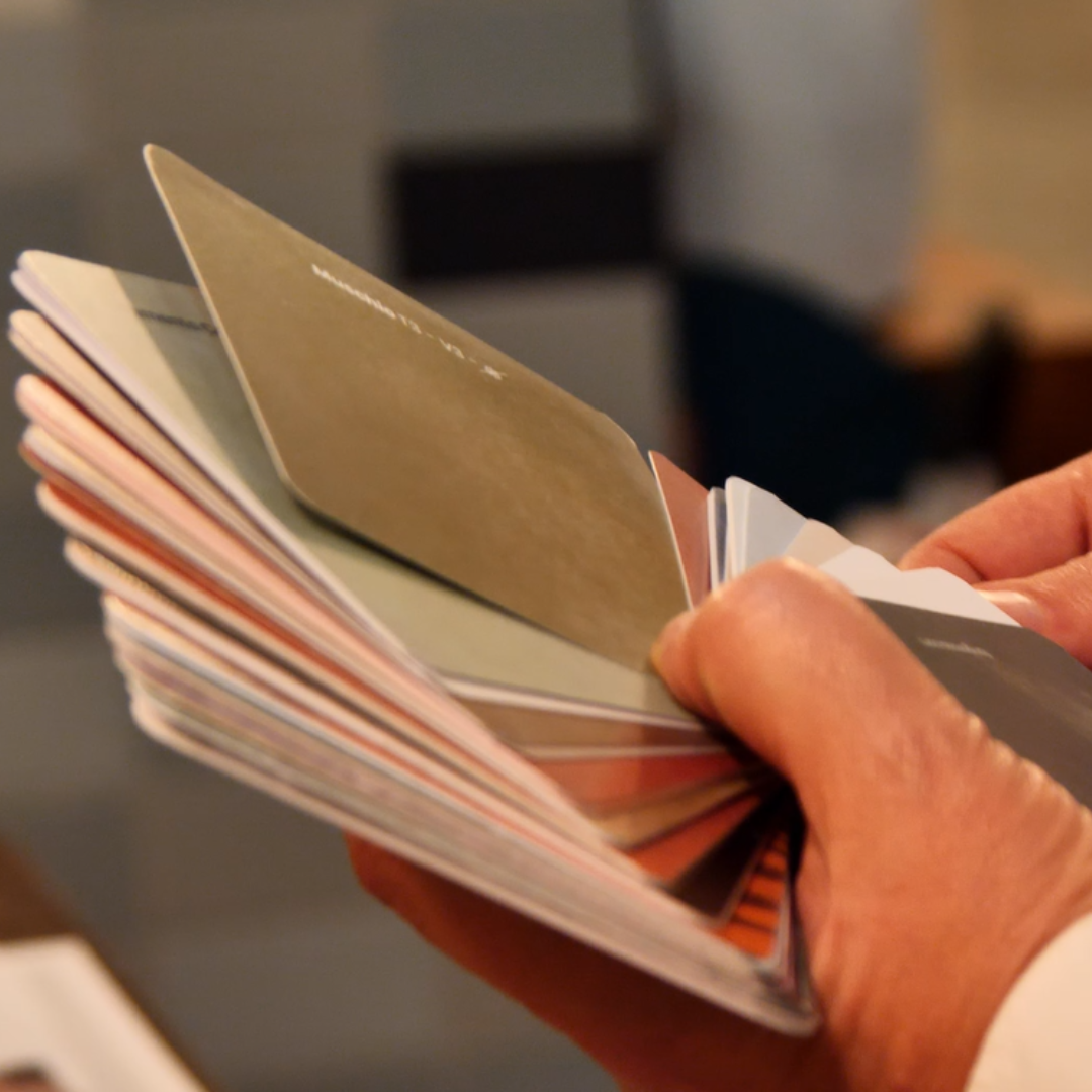
Practical and easy to carry everywhere. Essential for giving a client the coordinates and ideas of a possible project.
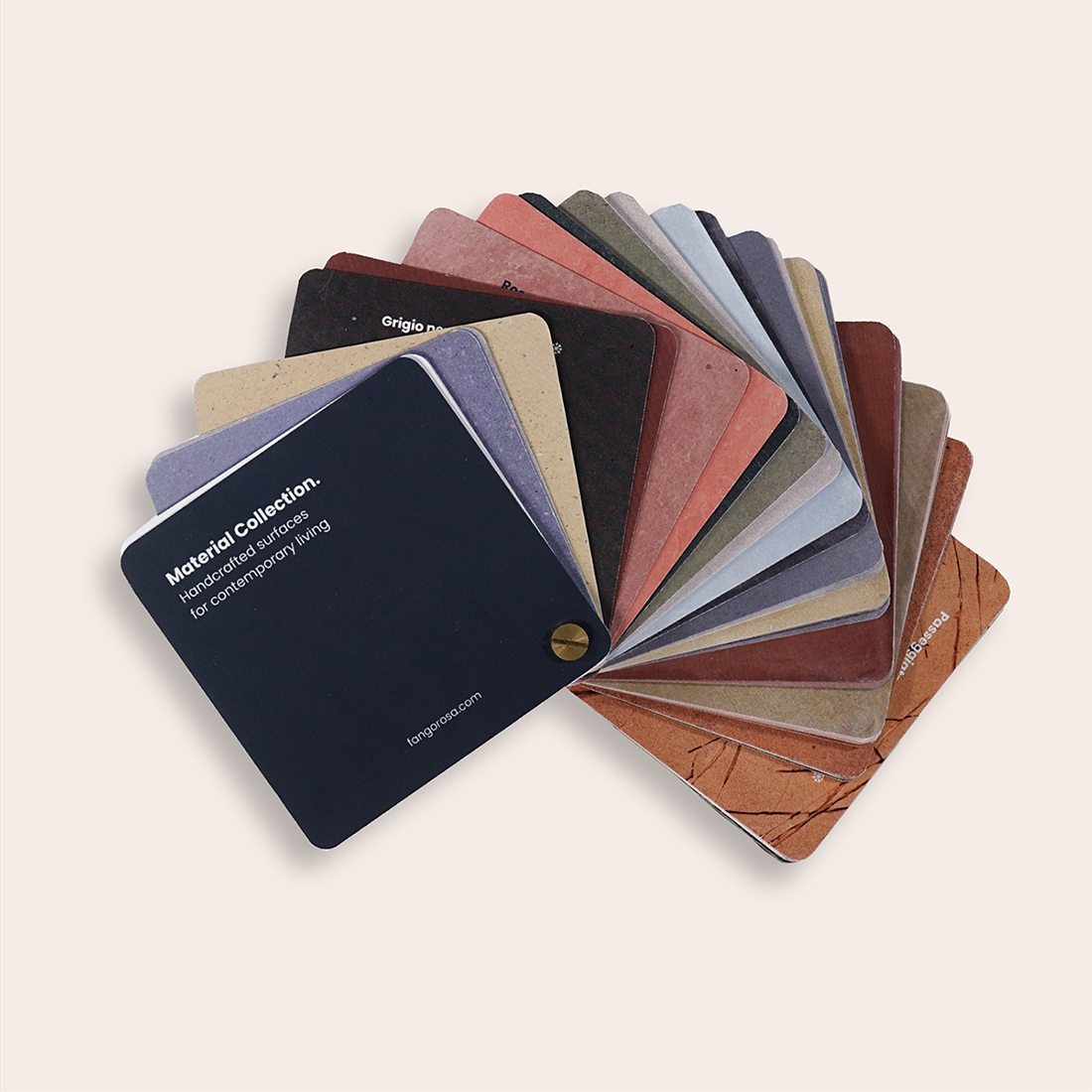
The Color Palette – Material Collection – includes 82 photorealistic textures in a small compact format, printed on coated and uncoated paper to make the visible and tactile quality of the material as truthful as possible.
This tool created to support the professionals is divided by material and at the beginning of each material there is a Technical Sheet with:
Available shapes
Colors
Collections
The materials you will find inside:
Roman and Sicilian concrete
Umbrian terracotta
Lombardy terracotta
Glazed terracotta
To help reading and maximize use, the sections feature subdivisions detailing available sizes, collections, and colors.
The year 2023 has just begun but Fangorosa’s agenda is already full of appointments and ideas to be fulfilled. The first one will be on January 26 in Conversano in the province of Bari. Fangorosa on the heel of the italian boot will repeat the “Aesthetics of Travel” format in the accompaniment of Olga Salvoni, CMF designer. The event will be held by Brand Ambassador, LOI, to stay updated also follow us on Instagram.